
01 / challenge
Start with the right question.
Dense dashboards can make every item appear equally urgent. This product concept explores how information could be organised around the task at hand without losing useful detail.
A considered dashboard concept that brings hierarchy, context and a quieter rhythm to complex information.
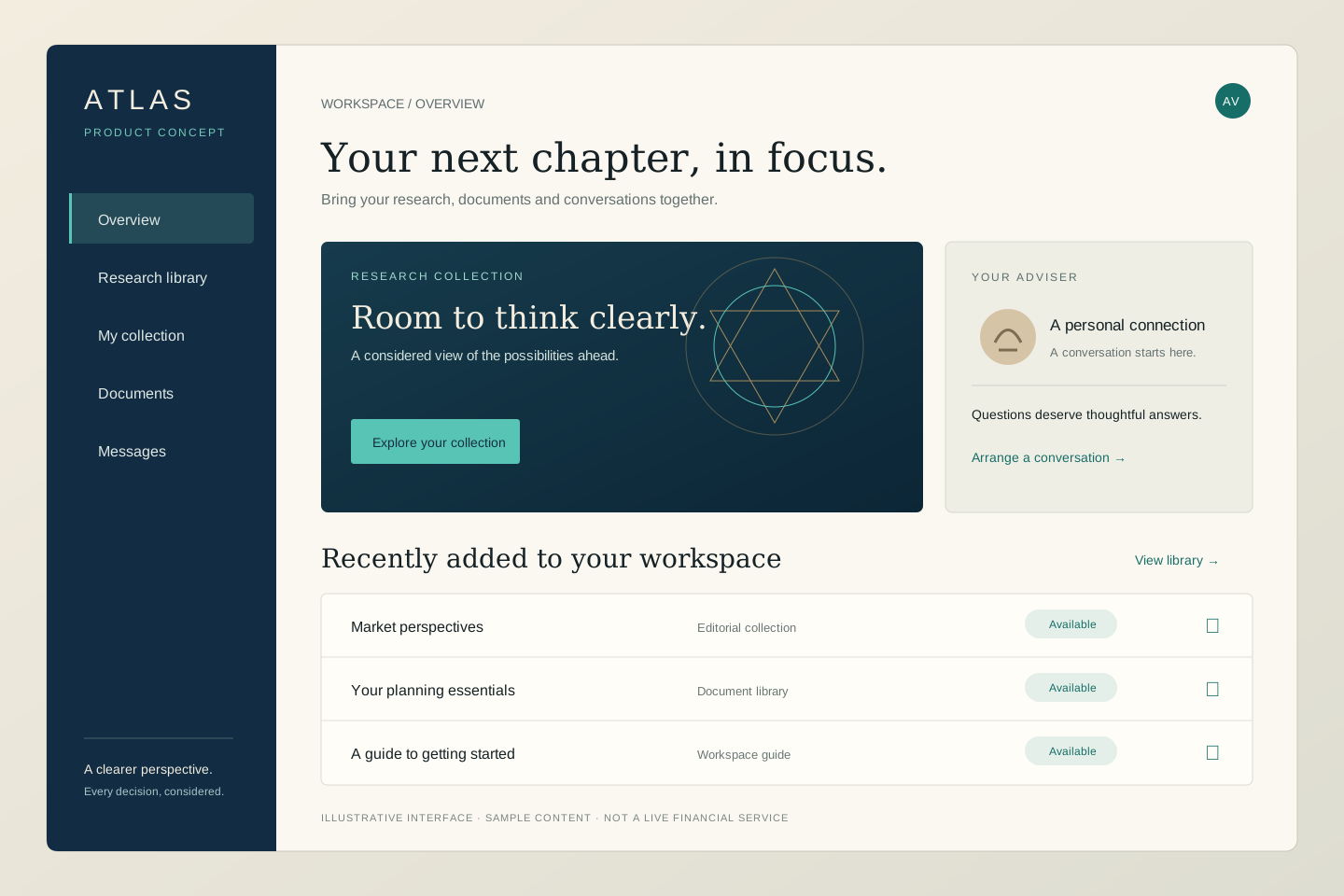
Dense dashboards can make every item appear equally urgent. This product concept explores how information could be organised around the task at hand without losing useful detail.
Distinguish the overview from the investigation. Give the user a clear starting point, consistent navigation and progressive access to supporting information.
Readable data surfaces, explicit labels and a disciplined contrast system establish a calm interface. Detail panels support the primary view instead of competing with it.
A production product would require validated user workflows, secure authentication, appropriate data permissions and verified integrations. The concept shown here is a visual study with sample content, not a functioning investment service.
A product-design exploration of information hierarchy and interaction. It does not represent a live financial product, investment advice, real account data or investment performance.
A new website. A better experience. A more confident first impression.